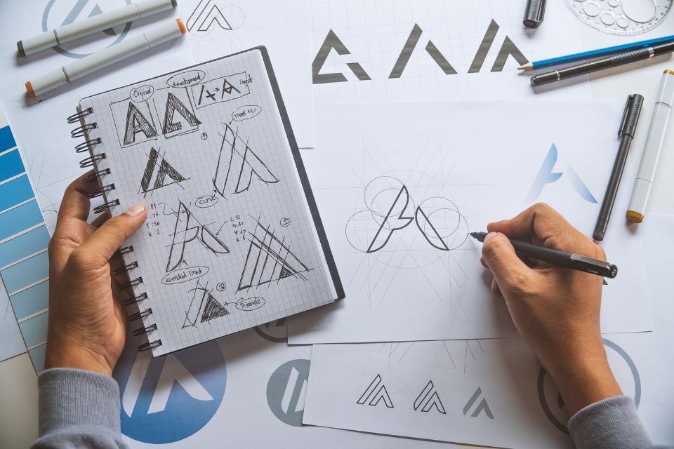
Logo design can be intimidating. From researching to choosing colors, fonts, and shapes, there’s a lot to decide.
To help you with the process, you must create a standout identity for your business, with the help of a logo maker tool. This post will walk you through everything you need to know about making the perfect logo for your business.
To help you with the process, you must create a standout identity for your business. This post will walk you through everything you need to know about making the perfect logo for your business.
From defining your brand identity to understanding what makes an excellent logo and navigating the design process, we got you covered.
Here are handy logo design tips for creating a branded website:
1. Know the brand
Before designing your logo, make sure you know your brand well. Your logo should reach a particular set of people, usually your target market and customers.
Make sure that you write what your brand, business, and market are all about. Know what your brand ideology is and what inspiration it holds for the future. You also need to develop a successful digital strategy for your organization that will meet ever-changing customer needs and build a “business moat” that creates a differentiator between you and your competitors.
You should also know your brand personality. How do you project yourself in your market and customers? This information will usually serve as a guide when creating your logo design. You need to choose logo elements based on the information about your brand.
2. Tell a story and convey a feeling
The best logos are usually the ones that tell a story or convey a particular feeling. When you create your brand identity, start with profound discovery and brand positioning.
It would help if you also created logos with the context in mind. Where will it live?
3. Check out the competition
One of the best places to get ideas is from your competition. Know what’s already out there. This lets you know what works well with your audience and what you should avoid.
When studying your competition, think about the things that make them different and how you will emphasize these differences in your logo design.
For instance, if your competitors are going monochrome, you may need to use some color to stand out. If everyone else follows the conventional route, opting for a more fun and modern take on your logo will get their attention.
4. Find the right type of logo
When choosing the right type of logo, one of the first things you need to do is choose the right design for your brand. So, pick what’s best for your brand.
- Classic: A classic style gives you better staying power and reaches a broader audience. The overall aesthetic also keeps it simple. It also conveys to people that you’re reliable and down to earth.
- Retro/Vintage: This has been a trend for quite some time now. These types of logos remind you of the past and evoke nostalgic feelings. They tell your customers that history is vital to you and that whatever you’re selling is done right. Hand-illustrated logos in brown and beige colors fit this aesthetic quite well.
- Modern/minimalist: You can also opt for a clean and minimalist style to have a fresh and modern take on your logo design. This also shows customers that your brand is up to date and knows what counts.
- Fun/quirky: This is an excellent choice for brands targeting a younger demographic. Having a fun and quirky style is often colorful and cute. You can also go for symbols and illustrations to create a more positive and friendly atmosphere.
- Handmade and handcrafted: This style can work great if combined with other aesthetics, such as vintage styles. You can also integrate it with fun and minimal styles for a simple or youthful look.
5. Pay attention to color
There’s also a psychology behind colors when used with brand logos. Every color carries significant meaning, and it also evokes certain emotions. Similarly, it also prompts your customers to take action.
For instance, you’ll notice that many food brands tend to use red because the color is believed to induce hunger. Many financial brands also use blue since it symbolizes trust and stability.
6. Create a versatile and scalable design
To make a good logo, you should make the entire design scalable. No matter your logo size, it should always look sharp and recognizable, whether the text or other elements.
It’s also worth noting that if your logos are too detailed or intricate, it could be challenging to scale them into a smaller size later on. While there isn’t a one size fits all rule for logos, you must ensure that your logo is a high-resolution vector.
That way, it could be easily adapted to different sizes and file types and look great in any setting.
7. Ensure readability
Your logos are used in all your branding assets, from your site headers to your business cards. Regardless of where your logo appears, the text should always be readable.
To ensure this, you must note the text size and fonts you’re using and then check the final results on different platforms and devices.
8. Focus on symmetry and balance
Great logos are balanced and symmetrical. This communicates to your audience that you have a robust and stable footing that could last the test of time.
Ensure that your logo looks even if an invisible line is drawn in the middle of the center of your proposed design.
9. Be memorable
One of the best logo tips we can give is to make it unforgettable. You want customers to notice your logo and remember it.
Think about logos that made an impact on you. How do they stand out? It would help if others have fun and meaningful associations with your brand. An excellent logo is one of the best ways you can stand out.
Over to You
So there you have it. You need to know your brand inside out to create a logo that truly stands out. Your logo should have a unique but straightforward design conveying your brand messaging. It should also be a versatile and scalable logo that leaves a mark. Good luck!
Need exceptional logo designers in Bangalore? Explore our services at Jootoor Designs for creative and impactful logo solutions.

