

This article originally appeared on Website Builder Expert and has been used with their permission.
Whether you’re building your new site’s brand from scratch, or are rethinking the palette of your existing website, this guide will help you choose the right color scheme. We’ll run you through the best colors for websites, and help you find the one that suits your site’s unique character and style.
After all, color is a massive aspect of branding. Ever noticed that almost every fast food restaurant uses red and yellow in their logos? That’s because together, these encourage hunger and friendliness. Orange implies fun and friendly, blue is reliable, and green suggests freshness and nature, while black indicates luxury or elegance.
So what do you want your brand to say? Read on for the best colors for websites, and which ones you should be building your brand’s personality around.
Why website colors are important
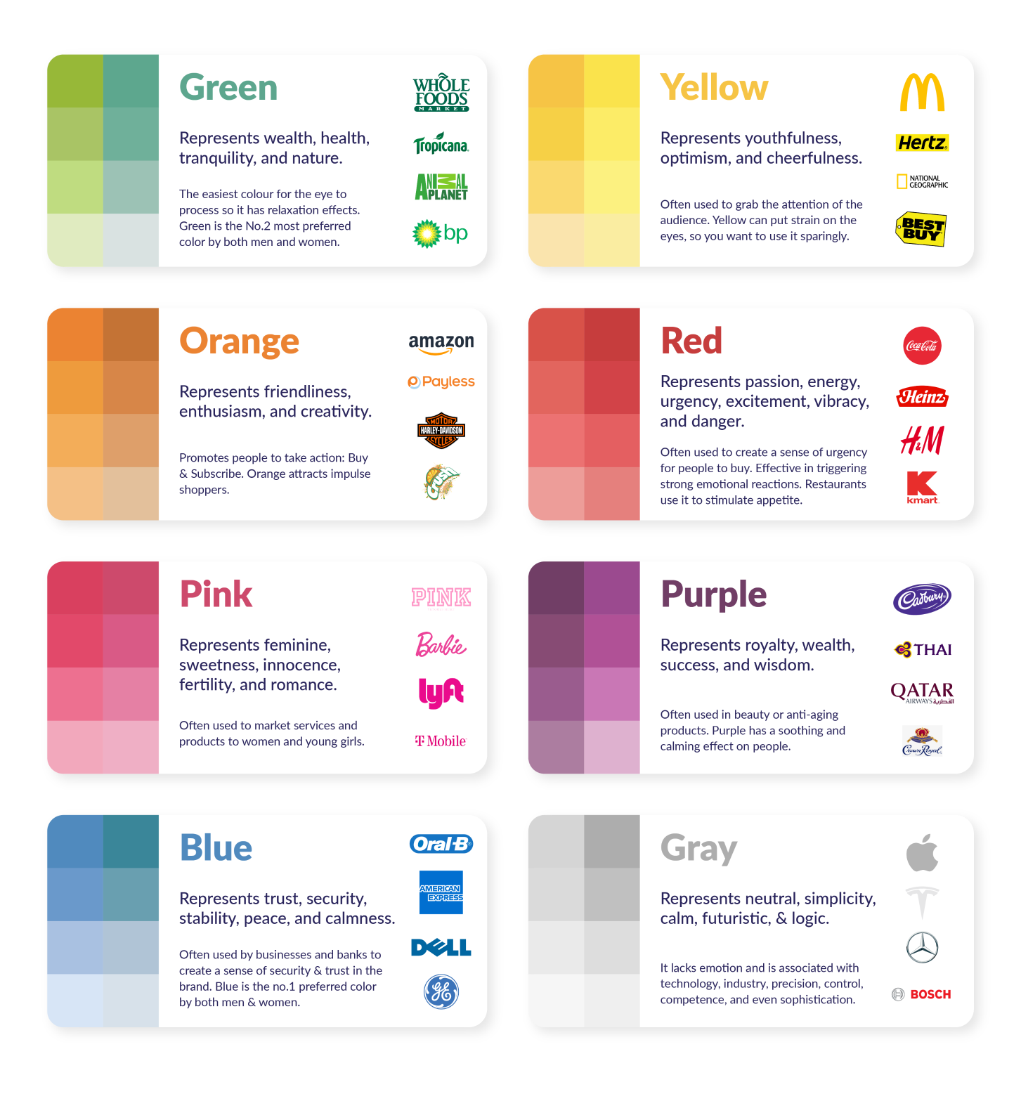
As we mentioned, colors can trigger certain feelings on sight. There is a lot behind color psychology – you can check out the infographic on this page for some interesting unpacking of different brands and the colors they use, as well as the feelings they inspire.
You might think that you aren’t affected by colors, but you’d be surprised to see the difference that color selection can make to a company’s bottom line. In fact, 85% of people claimed that color has a major influence on what they buy.
When some companies experimented with their button colors, they noticed a sharp uptick or decline in their conversions. For example, Beamax, a company that makes projection screens, noticed a gargantuan 53.1% increase in clicks on links that were red vs links that were blue.
And that’s not just clicks – a study run on the mental impact of colors found that colors boosted brand recognition by an average of 80%. For example, think of Coca-Cola, and you’ll likely picture their vibrant red cans.
Don’t take this to mean that red is king, however, as there’s no real rule to this. If your site is mainly red, a red call to action won’t stand out that much, so you’ll want to play around with colors until you find a combination that works for you.


Sources: Truelist, Business Insider, Reboot Online
How to choose a color scheme for your website
So how do you find one that works for you? Now you know how important colors are for your website’s branding and experience, let’s have a look at what you should do to decide on what colors you should pick.
You first need to get a good understanding of what you’re selling/providing. If you’re trying to achieve a more premium, high-end image, then purple is your go-to, as people associate it with royalty, high quality, and intrigue.
However, if you’re looking to reach a broader audience, blue is a reassuring, gentle color that fits well for more delicate subjects, like healthcare or financials.
Choose a primary color
The best way to decide on a primary color is to think about the vibe of your product or service and peruse colors that fit that vibe to find one you like. Here are some examples:
- Red: Coca-Cola or Nintendo – Implies excitement or happiness
- Orange: Nickelodeon or Fanta – Implies a friendly, fun time is ahead
- Yellow: Nikon or McDonalds – Implies optimism and happiness
- Green: Whole Foods or Animal Planet – Implies freshness and nature
- Blue: Walmart or American Express – Implies dependability and reassurance
- Purple: Hallmark or Cadbury – Implies a distinguished brand that has a history of quality
- Brown: Nespresso or UPS – Implies a reliable product that can be used by anyone
- Black: Chanel or Adidas – Implies luxury or elegance
- White: Apple or Nike – Implies sleek, user-friendly products
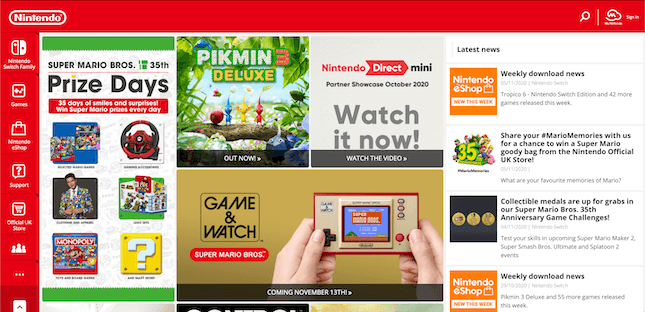
If you already have a colored logo, it makes sense to have a primary color that matches your existing branding. Nintendo’s branding is very red, and this comes through on their homepage.

This is probably the easiest step, as you’ll likely already have an idea of what color you want your website to be. Just make sure to save the hex code!
Choose your additional colors
Once you have a primary color in mind, it’s time to choose the other colors that you’ll be using. A good starting point here is to consider color compliments. Every color has a counterpart that makes it “pop,” and these are known as color compliments.
For example, a red circle on a green background pops a bit more than a blue circle on a green background. But a blue circle will look a lot better and more obvious on an orange background.
So if you’re using a predominantly green website, it’s a good idea to implement red calls to action or use red to highlight important features that you want to catch the eye of any readers.
Try to only have one or two colors on top of your primary color. More than that, and you’ll be struggling with clutter. Nothing will stand out well if you inundate visitors with loads of different stimuli.


A good example of using additional colors is hearing aid brand Eargo. It has a main color of orange, so it’s used this duller blue to highlight this important section of its website. From what we know about color compliments, we can see how this blue and bright orange contrast against each other. The orange also makes important elements pop, like the “add to cart” button and the logo.
Using a color wheel will help you find colors that work together. Complementary colors are located directly opposite from each other, and the three primary colors are on the triangle points.


Choose a background color
This is an important choice, as the background of your website is theoretically going to take up more space than any other color. However, it’s an easy choice to make, since it really boils down to two options.
You can go for a more muted version of your primary color to solidify your branding. This will require a white or grey overlay on the text background to show up.
Alternatively, you could just have the whole website be an off-white color, which is the more common choice. It’s inoffensive, and won’t stop anything – text, images, or links – from jumping off the page.


Look no further than our own website to see what a blank, gray background can highlight.
Choose a typeface color
The final stop on your colorful journey is to nail down a typeface color. You might go for the easy choice and choose black, but have a browse around the internet, and you’ll find that purely black typefaces aren’t as common as you’d think.
A black typeface on a white background can lead to eye strain, as there’s a 100% contrast – and people will be more likely to click away if your website is difficult to read.
While explicitly colored typefaces should be reserved for links and important bits of information, you can use gray or gray-tinted colors to give your website a softer, more inviting look. There isn’t a ton of room for experimentation, but it can be worth coloring your text for that finishing touch.


A quick look at this page on Penguin Books’ website shows that they’ve elected for a softer grey tone for their text. This is a lot less aggressive than a stark black and white contrast and allows for a softer vibe.
Tips for choosing website colors
By now, you’ll have a sense of what kind of color your website will be using. Here are a few additional tips for when you’re considering colors.
Use consistent saturation
One thing you can do to strengthen your brand is to use various colors with a similar saturation. Saturation is another way of saying a color’s brightness. Have a look at drink company Innocent’s usage of color:

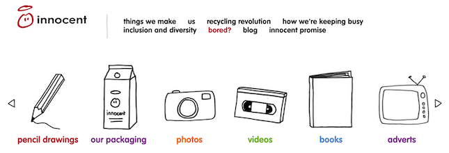
Here they have six different colors, but none of them feel out of place or jarring. That’s because their saturation is muted to the same level, making it feel consistent.
Use the same color, but vary saturation
When a brand has a strong connection with a certain color, it might not want to branch too far from it. However, everything being a single color can become a bit stale, so it can be fun to take your primary color and play with the saturation a bit. Have a look at the social media options in the bottom left of this TechCrunch article.


All five of them are a similar green but have varying levels of brightness. These vary up the visuals of the page, while also reinforcing the idea that a lighter green is synonymous with TechCrunch.
Further tips
For some more tips, check out our infographic below that highlights what different brand colors represent to consumers, how they’re used for various marketing purposes, and examples of brands using them within their own logos.

Useful resources to help you find and choose colors
If you’re ready to start looking for colors, where do you start? It can be tricky to nail down a shade when you’re just given a color wheel. More often than not, you pick something that looks entirely different when it’s implemented. And even if you find one color you like, you might want to find a palette that works well alongside it.
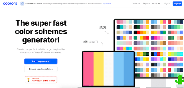
That’s why there are specialized tools to help you settle on a color scheme for your website. One example is Coolors – a website that helps you grab a premade color scheme and implement it into your website.

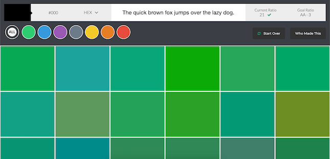
There’s also Color Safe, another website that lets you generate and browse colors by type, allowing you to find that perfect red or green.

Once you’ve formulated a palette, you can input your website onto checkmycolours.com, which will analyze your website and give you technical feedback on how effective your color scheme is for those with colorblindness or poor monitors.
How to Choose a Color for Your Website: Summary
Here are the steps you’ll want to take when picking colors for your website:
- Choose a primary color: Pick a color that suits the energy of your product or service.
- Choose your additional colors: Pick one or two additional colors that complement your primary color, ideally colors that make your primary color “pop.”
- Choose a background color: Choose a color for the background of your website – possibly less “aggressive” than your primary color.
- Choose a typeface color: Choose a color for the text that is going to be on your website – remember that a solid black typeface is rare and not recommended.
And don’t be afraid to use different resources online to find your perfect color combo – there are plenty around to sink your teeth into!