
Consumers care about how their favorite products are labeled — more so than they probably realize. Although you supposedly can’t judge a book by its cover, customers will often end up judging a product by its label. In many cases, they can be convinced to purchase a new product (or even make the switch from a brand they know well) due to impeccable label design.
Of course, the design of your product labels needs to align with your brand messaging and make sense for the product’s use and packaging. But there are other elements you can count on to pique a customer’s interest and entice them to add your product to their shopping cart.
From prioritizing the tactile experience to appealing to a consumer’s sense of social responsibility, your labels can play an integral role in how well your product moves once it’s on the shelves. Let’s take a closer look at just five of the biggest product label design trends to watch for as we head into 2021.
Want to download the infographic?
We’ve also created an infographic version of this blog post for easy sharing and downloading. To download the infographic, click the button below.Download
Eco-Friendly Materials
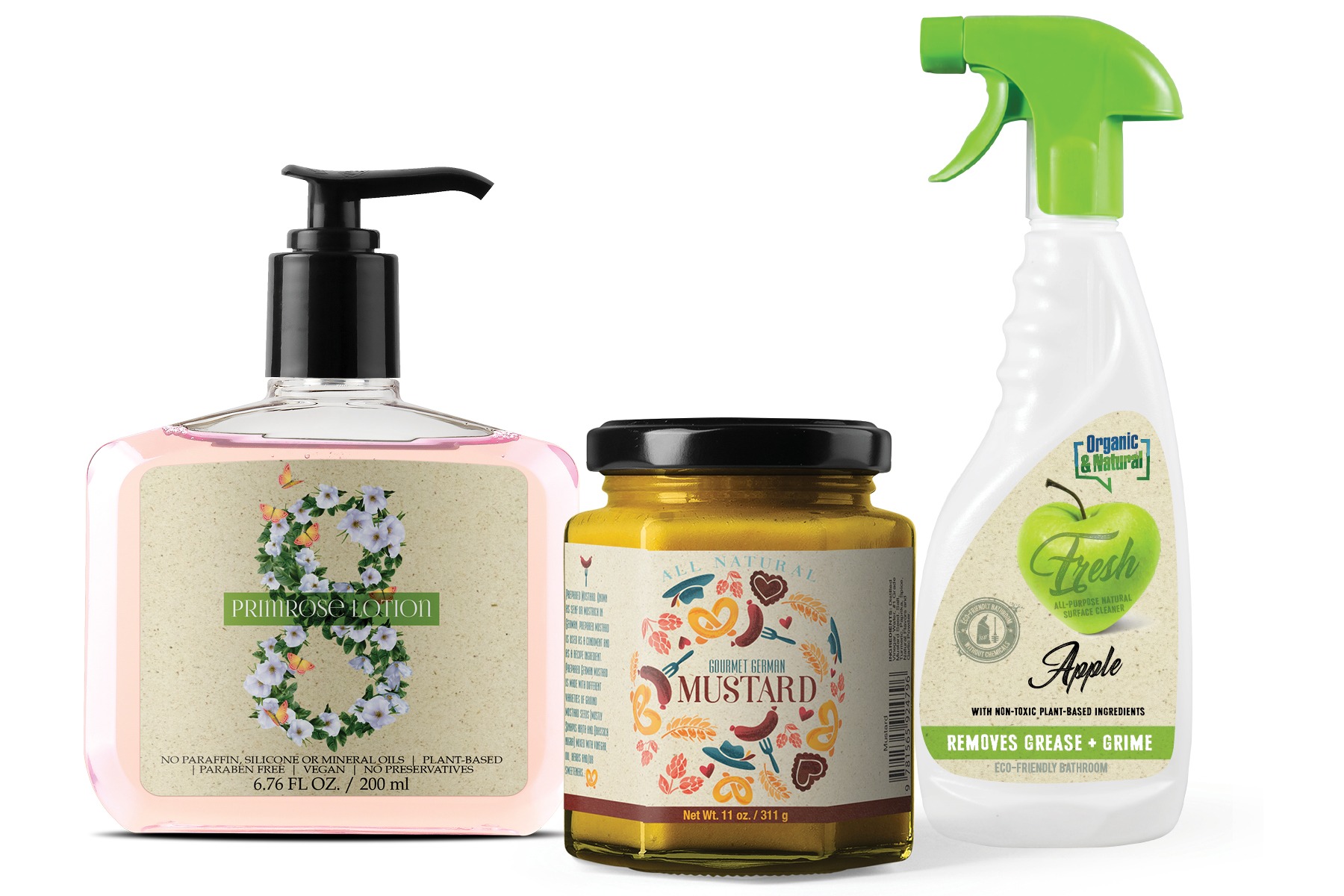
Being eco-friendly is more than just a passing fad. While sustainability may have once been a niche market, this is now a cause the masses care about. In fact, around 75% of U.S. adults say they’re concerned about helping the environment through their daily behaviors. What’s more, BBMG’s Conscious Consumer report revealed that 87% of U.S. consumers are more likely to buy from brands that have shown their commitment to eco-friendly practices. To make sure your commitment to sustainability is clear, consider using eco-friendly materials in your product packaging and labeling. Recycled and compostable labels are more commonplace than ever — and if consumers know that buying your product won’t create more unnecessary waste, that may tip the scales in your favor. Your product labels also make for the perfect place to highlight your organization’s other eco-friendly efforts.
Irresistible Texture
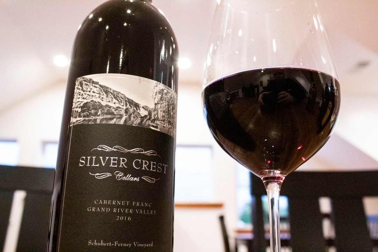
Your label design should address more than a consumer’s sense of sight. Touch also plays an important part in the purchasing experience. According to researchers from Bocconi University and Innsbruck University, overly crowded product displays can be visually overwhelming for customers. As a result, they’ll often rely on touch to make their buying decisions. You can use this knowledge to your advantage when designing a label. Making your labels provide a more tactile experience can set your product apart. If you’re hoping to target a higher-end market, for example, consider embossed labels. These embossed labels are viewed as being “premium.” Customers who touched products with these labels and liked the experience actually believed the products were worth more! Whatever kind of textured labels you choose, they can encourage customers to use more than their eyes when making a decision.
Bold Design
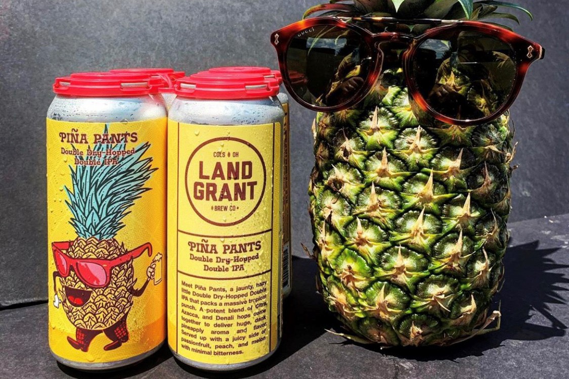
Product labels should rarely be boring. Although minimalism reigned supreme during the last decade, today’s consumers want something more exciting. Maximalism has (loudly) made itself known in the label design realm. These designs are characterized by ornate patterns, intricate details, and eye-catching colors. If you really want to make your product stand out in the store, you’ve got to go full-out. With so many products to compete with, your label design needs to stop customers in their tracks.
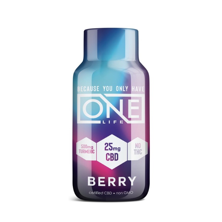
Retro-Futurism
Although product developers are always thinking about what’s next, you sometimes need to look to the past first. Retro-futurism is a design aesthetic that captures “the past’s vision of the future.” In other words, it’s what we thought the future would look like 50 years ago. It’s a concept rooted in 20th-century science fiction, but it’s just as relevant today. Customers enjoy the sense of nostalgia mixed with cutting-edge elements, as it’s familiar yet brand new. Neon colors are often mixed with mid-century retro elements with this type of label design. If this is an aesthetic that fits in with your brand or product, this design can be highly effective amongst consumers.
Transparent Labels
One thing is clear – customers really value transparency (both literal and figurative). In a Label Insight Food Revolution study, a staggering 94% of respondents said it was important to them that food brands are transparent about their ingredients and how their products are made. Customers want insight into what they’re putting into their bodies, and labels can provide you with the means to provide this valuable information. But it’s not only about being upfront; in some cases, you may want your labels to be transparent in other ways. See-through labels may be an appropriate choice for many products, as they allow the true color of the item to shine through. This can be an excellent option if you’ve chosen glass or non-colored plastic for your packaging. Rather than rely on graphic design, you can let the product speak for itself.
How We Can Help
Now that you know some of the latest label trends to look for in 2021, you can get to work on your design. Let’s talk about what Mammoth can do for you. Contact our digital label experts today for the innovative solutions that can make your products truly shine.
This post was originally published on Mammoth Labels and Packaging.