
According to research done, it was found that images had a significant impact on helping businesses increase their traffic, conversions, and clicks. It is because our brain only needs 1/10 of a second to process and understand an image.
Moreover, that is why it is also crucial for your image to be high-quality and look attractive. Your image design needs to be at the top of its game, and whenever you are not paying much attention to it, it may even affect your brand awareness.
You want to look as professional as possible, and that is why in this article, we will be showing you ten social media design tips you should follow.
10 social media design tips to follow
1. Optimize your image size for different social media networks
Don’t fall into the trap of thinking that every image size you use will appear the same on all social networks. What may be fit for Instagram won’t look good on Facebook or LinkedIn. Different social networks require different image sizes.
To make sure you find the correct dimensions, you should follow a social media image size guide. These guides show you image tools to optimize social media images for whichever platform you are using. Some image tools you can use are:
- Canva
- Biteable
- Adobe photoshop
- Pixlr, and more
2. Adjust the colors
Color is a vital part of any social media design. 92% of people stated that color is the most important part of visual stimulation and the number one factor affecting their purchase decisions.
Colors affect us subconsciously and on a level that we may not even realize at times. Different colors will initiate a different feeling in us. The color blue often invokes a calm feeling. Warmer colors like yellow and red will trigger a sense of warmth and comfort.
A study done by Hubspot showed two tested versions of a call-to-action (CTA) button, one being green and the other red. Green represented a non-threatening and friendly look, while red looked more dominant. More or less, the color red performed better than the color green by 23%.
3. Use a consistent style
Always choose a consistent style for your images, compatible with everything your brand stands for. For example, consider answering the following questions:
- What kind of product or service are you selling?
- What do your social followers prefer?
- What are your brand’s colors?
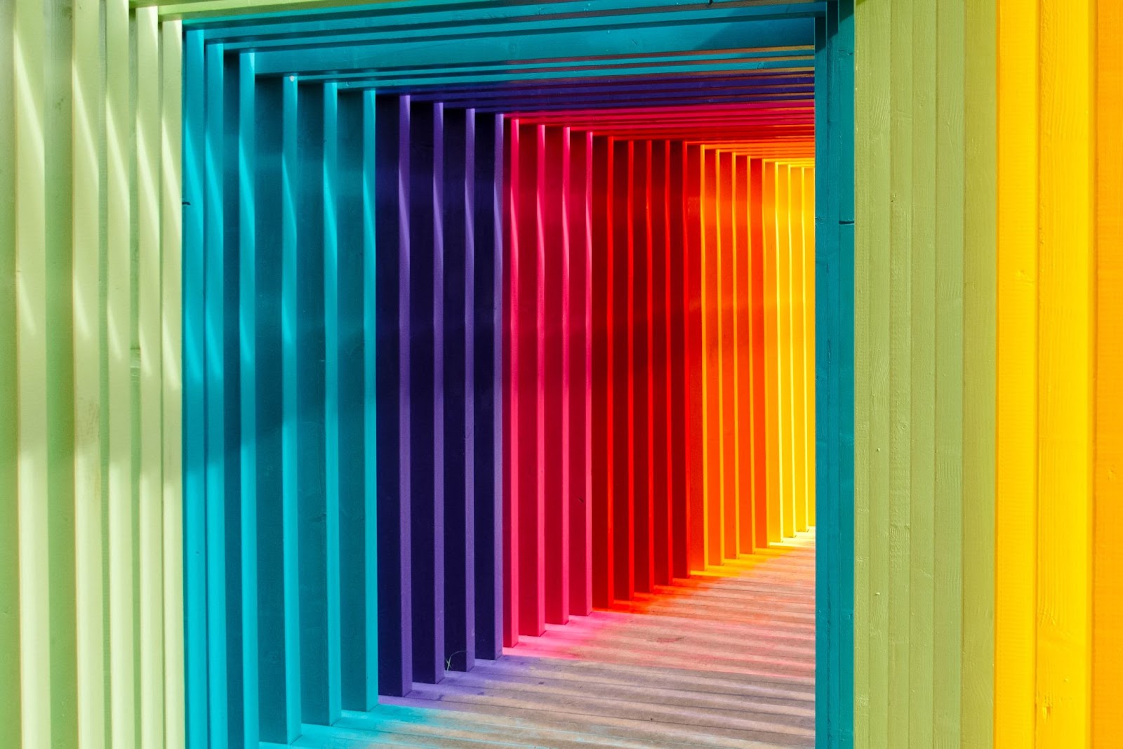
Answering these questions can significantly guide you to discover your brand’s personality and characteristics and find the images that best suit your brand. We want to keep our style identical to the images we create on social media. For example, let’s say my brand’s logo is built in two different colors: blue and white. The photo below represents an identical style to my brand logo.
4. Setup a brand design
Your brand logo, profile images, and cover photo should all represent specific colors. Although, they should all be identical to each other, whether through color, mood, text, or imagery. Avoid setting up a cover photo or profile image that is not in line with your brand logo.
For instance, you can try using a color picker tool, which will help you create color harmony.
5. Add contrast
If you ever see an image that caught your attention, you may be referring to the image’s contrast. Contrast provides differences between the elements of an image. It makes one element of the image stand out from the other.
Contrast is a good way of enhancing your social media images. Although, you should seek to find a balance between them. Too much contrast may make your design look confusing, and nothing may stand out. On the other hand, without contrast, your design may look too “flat.”
There are three different ways you may add contrast:
- Adding contrast with colors: the use of colors is the easiest way of implementing contrast into your social media image design. For example, mixing darker colors with lighter colors or the opposite.
- Adding contrast with sizes: add contrast in sizes by changing the sizes of an element in your image. For example, one text in your photo may be larger than another text.
- Adding contrast with shapes: Finally, shapes are another great way of adding contrast to your images.
For example, in the image below, you see that the yellow flower is the main focus of the image. This is an excellent example of using contrast to make an element of your image stand out.

6. Create templates
Templates are a great way of providing consistency in your social media posting and saving time since you can have a set of templates that are ready to use whenever you need them.
For example, you may use the same template for many different images by making a few tweaks with the color and other elements of the image. Let’s say I create a photo with the same design and use it for three different posts, the design remains the same, but the only thing I changed was the text and color. Below, you will find an example of the same template, just with different colors.

7. Create valuable content
Social media design gets just as good when you combine it with valuable content on the photo. Valuable content is the key to reaching more people across the globe and not be limited to only a few templates.
When posting your social media images, you can consider including:
- Industry tips
- Event posts
- Infographics
- Motivational quotes
- Providing free information and more
Providing content on your social media images can be important for customer loyalty. According to Hootsuite Academy, posting content consistently is vital if you want to build long-term relationships with your customers.

8. Use hierarchy
Don’t forget to make the most important elements stand out in your image. Unless your image is really basic, you are likely to deal with multiple elements in your social media design. That is why we use hierarchy to make the most important element of the image stand out.
For example, if your image has three words, and the last word is the focal point of the message being delivered, then make that word bigger than the other words. Take a look at the image below on how the word “you” is the main focal point of the image. This is a perfect example of image hierarchy.

9. Adjust design based on analytics
Social media is moving at a fast pace each day. Your content isn’t the only one out there, and in only a matter of hours, it gets lost in the millions of other posts that are released. Although, don’t worry because the market loves speed.
The highest amount of impressions, comments, likes, shares you will get are within the first hours you post on social media. Considering this, you can adjust your analytics quicker and see which type of design brings you the best results. You can try a particular design for a certain period of time and then change things up to see what is the best choice for your social media strategy.
Try to avoid testing a design only once and already judging the results that quickly, It doesn’t work that way. Check the analytics within a month or a week and then decide to compare.
10. Create custom graphics
We are not asking you to spend tons of money on photography, although there is a huge difference when you compare stock images with your own. Numerous brands may use stock images, and that is where you don’t have the chance to look unique when using an image that others use.
It’s without a doubt worth spending time taking your photos and creating graphics that align with the kind of images you want to share on social media.
We don’t mean you have to be taking professional-quality photos all the time. You can even use a picture at the workplace to post on social media. At least it is unique, right?
Moreover, if you choose to use stock photos, try to include something unique in them. Even a simple change in color or an adjustment might change everything!
Wrapping it up
That’s all for this article. Hopefully, it has presented you with new ways to provide eye-catching designs on your social media channels. Always remember that images engage people much more than plain texts without any images. Infographics claim that channels with images get up to 200% more shares than those without any.
This article gives you the most vital tips you need for your social media design strategy. You must read through them carefully and try implementing examples like the ones we set, and you will be surprised at how quickly your results will come.
Use the consistency, adjustments, and correct image size for the social media platform you are using. Include great content, a high-quality image and make the most important element of the image stand out. Otherwise, you are on the path to an excellent social media visual strategy!