
It only takes 50 milliseconds for visitors to form an opinion about your website. That’s right – in just a fraction of a second, they’ll decide whether your site looks professional, and whether they want to stay or leave. And 94% of those first impressions are design related.
In short, visitors will immediately judge your website based on the quality of its design.
2021 will call for a user-first approach to web design – a trend confirmed by Google in its recent announcement that page experience will become a ranking factor this year. Factors such as usability, page-speed, mobile-friendliness, and security will all have a huge part to play in securing higher Google rankings. The message is clear: if you want to rank well, you need to put users first when designing your website.
Whether you’re building a new website or wondering how to improve an existing one, we’re here to help you make an impact for the right reasons. We’ve tracked the trends, analyzed the stats, and are ready to show you how to make your site look awesome in 2021.
Don’t lose visitors, sales, or social shares because of sketchy web design – check out these trends and statistics, and make good design choices instead!
- 1Trend #1: Photography With Graphics
- 2Trend #2: Bold Fonts
- 3Trend #3: Visual Hierarchy
- 4Trend #4: Personalized and Localized Content
- 5Trend #5: Mobile-Focused Ecommerce
- 6Trend #6: Faster Website Load Speeds
- 2021 Web Trends: Wrap-Up
Trend #1: Photography With Graphics
The Stats Behind the Trend:
What Is It?
Combining photography and illustration in one graphic is a stylish, modern, and – most importantly – eye-catching way of revamping images on your website. It’s a striking trend that is super effective for grabbing attention and saying something more interesting with your visuals.
Why Does It Work?
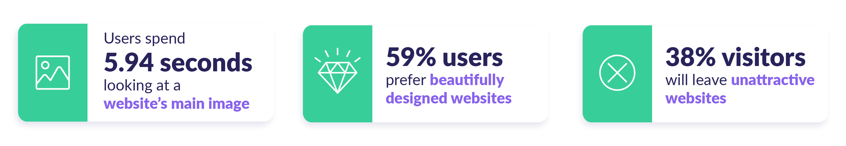
People like to look at beautiful things. As it turns out, your website visitors are shallow – 38% of them will stop engaging with a website if they find the content or layout unattractive. So what better way to keep them on-site than with an eye-catching image?

Given 15 minutes, 66% of users would rather look at a beautifully designed site than a simple or plain one. Combining photography with graphics turns possibly boring images into something new, fun, and instantly engaging to capture attention and lift your overall design.
How Should You Use It?
#1. Use a photography/illustration blend as the main image on your homepage.
It’s been shown that people spend an average of 5.94 seconds looking at a website’s main image – it’s vital that your main image is engaging, interesting, and on-brand.
#2. Replace boring stock imagery with fresh, mixed graphics.
Eye-tracking studies carried out by Nielsen Norman show that generic, filler stock imagery actually gets ignored by users. Bad stock imagery belongs in the past – combining photography with illustration is a much fresher and more modern approach.Go to the top 2
Trend #2: Bold Fonts
The Stats Behind the Trend:
What Is It?

Bold fonts aren’t exactly new, but they’re set to live up to their full potential in 2021. Big brands such as Apple, Twitter, and Google are using bold fonts and large, bold headings to great effect already, and this is something you can easily replicate on your own website!
Why Does It Work?
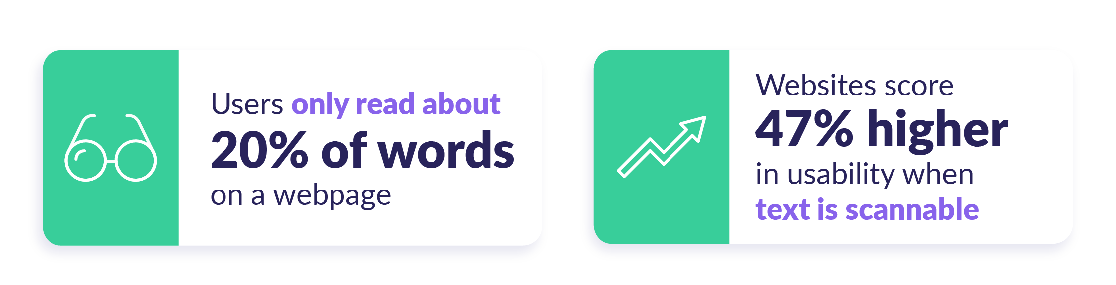
Bold text can bring a crisp, modern look to websites, depending on which font you choose. However, aside from just looking good, they also serve a more functional purpose – they make your pages scannable and easy to digest.
Most website visitors only spend 5.59 seconds looking at written content, so it’s vital that your online copy is quick and easy to read, short, and on-brand. Large, bold fonts deliver key information in an instant, without bogging the page down in long chunks of text.
People hate to be faced with huge pages of text when they land on a website. In fact, on average, most users only read around 20% of the words on a page!
Your visitors’ short attention spans means it’s important to break up any text to make your pages more inviting, and make it easier to quickly gather any important information. Large, bold fonts make your text more readable, and make your website look good while they’re at it.
How Should You Use It?
#1. Pick out important information
Now, bold fonts are great, but you want to use them wisely. If everything stands out then nothing does, so pick out the most important text to highlight.
Remember that bold fonts naturally draw attention, so perhaps you could use bold headings to draw a user’s gaze down your webpage. This is something Apple does well:

#2. Re-think your written content
When using bold, heavy fonts, you need to slim down your copy or it’ll become overwhelming. If you have a long page of copy, add in bold headings to help users navigate the text.

Even more radically, could you slim down and split up the text into bite-size, bold chunks?

#3. Adjust your page design to match
If you increase the size and weight of your fonts, it’s a good idea to increase the amount of white space you’re using in order to give your text enough room.
You should also consider tweaking the font size of your “normal” text, buttons, and subheadings. If you don’t update the sizes (or hierarchy) of other elements on your page, they may look a bit too small in comparison to your shiny, new, and very large headings.Go to the top 3
Trend #3: Visual Hierarchy
The Stats Behind the Trend:
What Is It?

Visual hierarchy means designing your homepage so that people know exactly what to do and where to look when they land on your site.
A website without visual hierarchy will struggle to keep visitors happy and will look pretty chaotic. As internet users, we have certain design expectations – for example, top menu navigation, headings that are larger than paragraph text, bright colors signalling important elements.
These are all examples of visual hierarchy because they help visitors navigate the web page. Imagine if paragraph text was bigger than the headings – this would be confusing! Challenging design norms can be fun, but it’s not always a good thing if you take it too far.
You can play with your design, but always remember who you’re designing for. Visual hierarchy helps your visitors to quickly find your most important information and tells them what to do with it!
Why Does It Work?
People are impatient. If they land on your site and can’t find the information they’re looking for, they will leave. It’s vital to strike a balance between your design elements to help users navigate your website.
A statistic we mentioned earlier is that 38% of visitors will leave a page if the layout or content is unattractive. Visual hierarchy makes content more attractive because it gives order to your design, making it more pleasing and helpful for your visitors.
Understanding visual hierarchy can help you arrange your design elements.
For example, did you know that users spend 80% of their time viewing the left half of the webpage? So if you want users to quickly find information, it makes sense to put important content on the left-hand side of your page.

How Should You Use It?
#1. Give the people what they want – don’t stray too far from best practices
There are a few web design standards that are worth thinking twice about before messing with. These include:
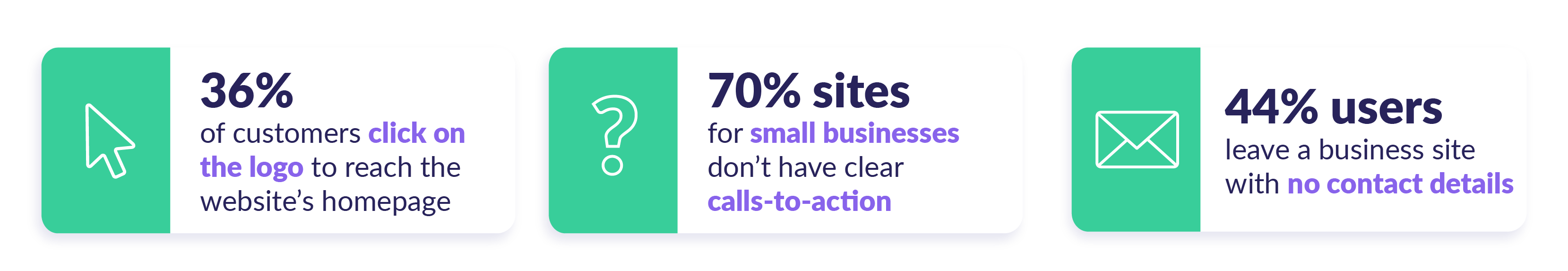
- Your logo. 36% of people click the logo to get back to the homepage – so the logo needs to be easy to find, and remain in sight at all times.
- Menu navigation. People expect to see this at the top of the page, usually on the left.
- Heading size versus paragraph size. Headings should be larger than subheadings, which in turn should be larger than paragraph text.
- Calls to action. What exactly do you want the visitor to do on your page? Don’t forget a call to action – 70% of small business sites are missing out by forgetting this!
- Contact information. 64% of users want to see a company’s contact information on the homepage, so make it easy to find.
#2. Think about size and space
People look at larger text first, so consider what the most important piece of copy is on your homepage. Make sure it’s larger than any other text, and that it’s instantly visible (so users don’t have to scroll to find it).
When playing with different sized elements – whether it’s text, images, buttons, or icons – you also need to consider how much space surrounds each one. Not giving elements enough space will result in a cluttered looking webpage.

For example, health drink Boost’s website feels larger than life thanks to its huge text and revolving, 3D image of the product that sticks with you while you scroll. It works, though, because of the generous white space surrounding each element.
It’s also important to note that using size to draw attention only works if some elements are smaller! Rank each element in order of importance and translate it into different sizings.
#3. Use color
Say you’ve got a big, bold heading on your homepage, and a large image too. You’ve got your visitor’s attention, and next you want to draw their focus to a call to action. Try making it a bright color to stand out against your main color scheme!
Color is a great way to show that something is important, without cluttering your site with oversized elements. As always, though, use bright colors sparingly and make sure it doesn’t clash with your existing palette.

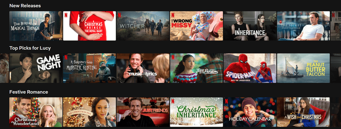
A great example is Netflix, which has used a large heading that captures exactly what Netflix is offering consumers. It then uses bright red to draw attention to its logo, and two calls to action. This effectively shows the user where to focus, without cluttering up its homepage.Go to the top 4
Trend #4: Personalized and Localized Content
The Stats Behind the Trend:
What Is It?

Once upon a time, businesses used the same marketing methods for every single one of their customers. Think back to days when billboards, TV adverts, and ads in newspapers were the only form of communication between a store and its customers.
The trouble with that approach is it’s pretty generic. Nowadays, people want unique, individual, tailored experiences that speak directly to them.
Whether it’s in the form of cookies that track individual preferences or geolocation tracking that tailors language and currency to the consumer’s location, people expect a more personalized online experience.
While a fully personalized online experience may sound pretty demanding, it can take your website to the next level. This is most helpful for ecommerce and business sites, but adding just a drop of personalization to any site can really boost engagement – 93% of companies have seen a boost in conversions after using personalization!
Why Does It Work?
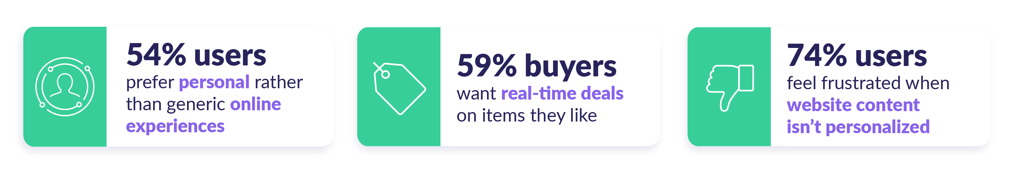
Personalization works because people like to feel special – indeed, 54% of global users prefer personal experiences over generic ones. As consumers, we demand a much more individual approach and a very high level of engagement from the brands we choose to shop with.
Your visitors don’t want to feel like just another number on your analytics dashboard – they want to feel like you’re speaking directly to them. 44% of consumers say they’re likely to become repeat buyers after a personalized shopping experience with a particular brand.
How Should You Use It?
#1. Localize your checkout
According to research carried out by Stripe, which looked at the top 450 European ecommerce sites, lack of translation is the most common checkout error. The study showed that 74% of checkouts did not have local language translations, and failed to offer the most relevant payment options for international customers.
Localizing your checkout is a great way to offer a more personalized experience to customers. There are two main ways to do this – by translating content for international buyers, and making sure you offer a range of payment options too.
55% of users would cancel their purchase if their preferred payment method wasn’t available. These payment preferences vary from country to country, so make sure to do your research to find out the most popular payment options in each market.
Alongside payment options, you should also localize the currencies you’re offering, especially when you consider that 33% of consumers are likely to abandon their purchase if prices are only available in US dollars.
Likewise, 72.4% of consumers are more likely to buy products in their native language, so consider creating a multi language store if you’re selling internationally.
#2. Provide real-time offers
59% of customers would like to be given offers in real-time while they’re browsing your products online. Something as simple as a popup or automatic discount can start to create a more personalized experience – anything that makes your customer feel like you’re rewarding them in the moment.
#3. Use cookies, geo-location, or sign-ups to personalize content
Using visitors’ personal information is perhaps the most effective way to create a personalized experience on your website. These days people are used to seeing messages about cookies, but you should still be careful about using or storing people’s data.

Email signups or on-site logins can be a great way of delivering more personalized content. You can use visitors’ names, tailor the content they see based on their past interests, and even offer birthday discounts!Go to the top 5
Trend #5: Mobile-Focused Ecommerce
The Stats Behind the Trend:
What Is It?

While sales made via desktop are still worth more money on average, mobile ecommerce has been on the rise for years – and 2020 was the year that saw mobile traffic skyrocket into serious figures.
Making sure that your online store has a mobile-friendly design is now more important than ever if you want to keep growing your traffic – not to mention your sales. A mobile first or responsive design means people can easily browse and buy from your store on their mobile devices.
Out of all the trends on this page, mobile-focused ecommerce is one that’s sure to stay relevant year after year.
Why Does It Work?
In the first quarter of 2020, mobile ecommerce traffic grew by 25% to make up a whopping 71% of total traffic.
If your store isn’t optimized for mobile users, you’re missing out on all that traffic. And you can bet you’re missing out on sales because of it – mobile now represents 56% of total order share!
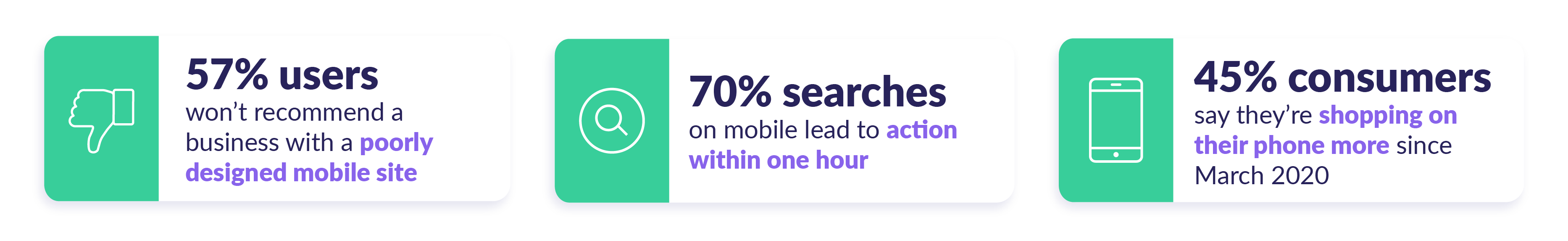
When it comes down to it, mobile devices are a huge part of our everyday lives. Mobile minutes accounted for 77% of online time in the US in 2019, and 45% of consumers say they’re shopping on their phones more since March 2020.
People want to browse products, compare prices, and shop from their phones – and they expect businesses to keep up with their needs.
In fact, 57% of users won’t recommend a business with a poorly designed mobile website!
If you have a clunky, outdated mobile site, you’re making life difficult for customers while sending a message that you’re falling behind the times. 61% of users are unlikely to return to a mobile site if they struggled to access it – and 40% go to a competitor site instead.
If your mobile site requires users to zoom in, scroll around, or tap repeatedly on tiny links, then you need to focus on this trend and optimize your mobile experience!
How Should You Use It?
#1. Keep your design clutter-free.
Mobile is all about keeping things clean, simple, and most of all, easy to use. Strip back your design to the basics. Ask yourself:
- Why are visitors coming to my site?
- What is most important to them?
- How can I deliver those results as fast as possible?
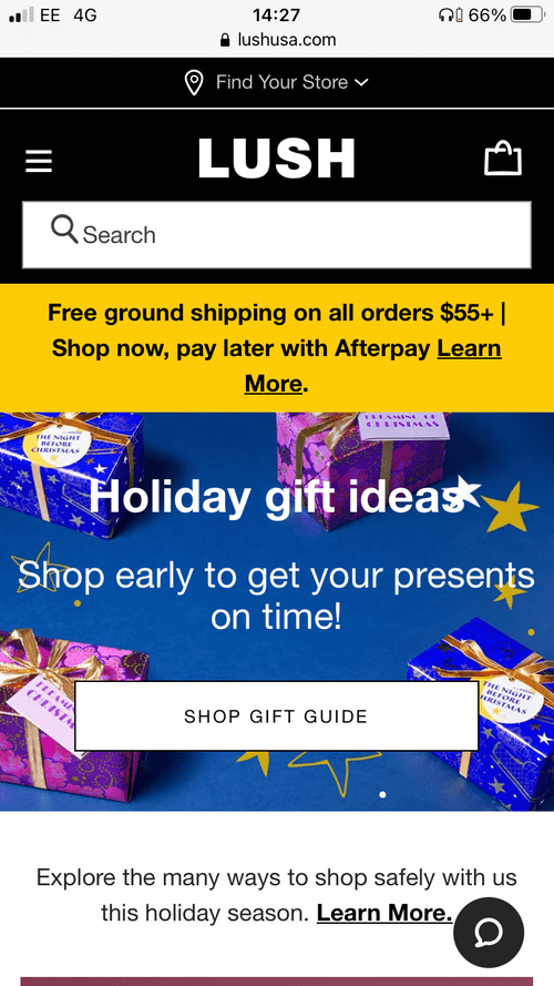
The Lush mobile site looks bright and busy – proving simple doesn’t have to mean boring – while giving you all the key information you need to start shipping. This includes:
- A search feature
- A ‘Find Your Store’ function
- Easy access menu and basket icons
- The Lush logo
- Shipping information
- A ‘Shop Now’ call to action
- Live chat button
- COVID-19 safety information
All of this is displayed straight away, without the user even having to scroll down – and it’s not overwhelming or confusing either!
#2. Use plenty of white space.
White space doesn’t actually have to be white, but giving elements plenty of room helps to keep your design simple – while also making it easier for people to tap on buttons with their thumb or finger.

Natreve uses plenty of white space to give its mobile site a clean, on-brand aesthetic that’s easy to digest. And it’s made use of our first trend – combining photographs with illustration graphics completes its modern look.
Find out more
Intrigued by the rise of mobile commerce? Discover more Ecommerce Statistics and dive into our breakdown of how 2020 impacted the ecommerce industry!Go to the top 6
Trend #6: Faster Website Load Speeds
The Stats Behind the Trend:

What Is It?
Fast loading websites are better than slow-loading ones. Not only that, but they’re better than average-loading sites, too. In fact, your website should load in three seconds or less to keep visitors happy – and you’ll find it helps your SEO rankings in Google as well!
Find out more
Check out our Website Load Times Statistics page for more detailed insights into why loading speeds are important, how load times affect businesses, how to improve site speed, and more.
Why Does It Work?
For such an important and long-lasting trend, the reasoning behind faster loading sites is pretty simple – people are impatient. Like, really impatient. 46% of people name waiting for pages to load as the thing they dislike most about mobile browsing, and just a one second delay reduces customer satisfaction by 16%.
Although site speed has always been vital for online success, the need for speed is only growing more urgent.
A survey of over 5,000 websites showed that in 2020, the average PageSpeed score was 44, a score labelled as “poor” by Google. Another analysis of 5 million pages showed that the average time it takes to load a webpage is 10.3 seconds on desktop.
According to the Google speed police, speeds this slow are not good. If your website takes longer than three seconds to load, it’s time to shed any dead weight in your web design, and deliver lightning fast speeds to your impatient visitors.
How Should You Use It?
#1. Compress your images
You’d be amazed at how much images can slow down your webpages, and how large some images actually are. During site speed research, Google found that 79% of pages were over 1MB, and 23% were over 4MB.
Is the answer to ruthlessly cut away your images? No – images are vital for engaging visitors and enhancing your content. The answer is to compress your files before uploading them to your website. You can use an online compressing tool like kraken.io to do so for free.
25% of pages could save more than 250KB by simply compressing images. You’re well on your way to faster loading pages already!
#2. Test your site speed
If you’re not sure how fast or slow your website is, it’s time to find out. You can easily find out using a free tool such as Pingdom or Google’s PageSpeed Insights tool. Simply enter your URL to receive tips on how to improve your loading speeds.
#3. Check your hosting
A common, but often unsuspected factor in slow-loading websites is your hosting plan or provider. If you’re on a shared plan, this could be dragging your site speed down. Reassess your plan to see if upgrading to a VPS or cloud hosting plan is a viable option.
Alternatively, make sure you’re hosting with a reliable provider – the best hosts will have optimized servers to make sure your site runs as quickly and smoothly as possible. If your web host is letting you down, it could be time to switch.
#4. Use smart content loading
Lazy loading is a tactic where your webpage loads the visible content first, very quickly, then loads content further down the page afterward. This means visitors aren’t waiting for the whole page to load before they can start engaging with your site, speeding up the process.
This post was originally published on WebsiteBuilderExpert