
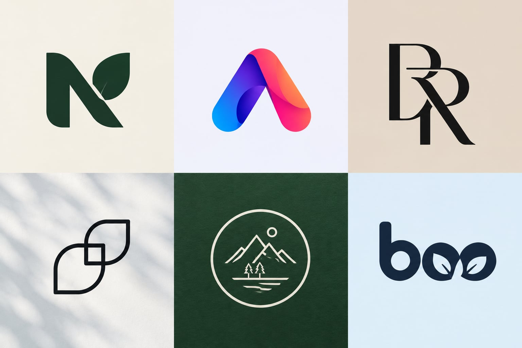
A logo can look perfectly fine on your laptop and still fail when you put it on a business card, storefront, Instagram profile, or product label. I see this often. Businesses fall in love with a style before asking whether it actually works for their brand.
That’s why branding and logo design in Santa Clara is becoming less about chasing the newest visual fad and more about creating identity systems with personality, flexibility, and purpose. The 2026 design landscape reflects that shift, with designers moving between technology-driven precision and more human, crafted styles.
Why Do Logo Design Trends Matter for Modern Brands?
Trends are useful when they help you understand where visual communication is going. They are not rules you have to follow.
For example, the current movement toward warmer, more tactile creative logo design ideas is partly a response to increasingly automated and AI-generated visuals. Creative Bloq highlights this shift toward authenticity, personality, and meaningful distinction.
I always recommend starting with the brand problem first. The Design Council’s Double Diamond framework similarly puts discovery and definition before developing and delivering a solution. And most professional logo design services in the Bay Area swear by it.
6 Modern Logo Design Trends For 2026
- Minimalist Logo Design With a Twist
Minimalism is simply becoming more interesting rather than just disappearing. A clean logo gets one memorable quirk. You can see it in designer J.J. Almeida’s portfolio, where tiny breaks, dots, or shifts become tiny anchors, while Cindric’s work shows how one unexpected detail can give a simple mark more personality.
For your business, that could mean an unusual letterform, clever negative space, or a tiny visual interruption. The trick is hiring a full-service creative agency in Santa Clara that knows when to stop.
- Heritage Logo Typography Trend
Forget the idea that typography must always look sleek and corporate. Story-driven gothic and heritage lettering is gaining attention in 2026.
The Yokaona examples show how gothic structures and historic influences can create a strong sense of story without making a brand look like it belongs in another century. This can work beautifully for fashion, food, craft, hospitality, and lifestyle businesses.
- Responsive and Adaptive Logo Systems
A logo rarely lives in one place anymore. It needs to work on your website, social media, packaging, signage, and sometimes in motion.
Examples from codavine demonstrate the idea of morphing or adaptive marks: one core identity can change across different contexts while remaining recognizable. This is a smarter approach than squeezing one complicated logo into every space.
- Geometric Shapes and Structured Designs
Pixel-sharp precision is another interesting direction. Artsigma’s work uses crisp, structured forms that feel digital and intentional.
This works especially well for technology, SaaS, engineering, finance, and data-focused businesses. But don’t make the mark so rigid that it loses character.
- Creative Logo Designs That Feel Human
This may be my favorite shift. Hand-drawn symbols, imperfect lines, warm curves, and illustrated mascots are bringing personality back into branding.
Look at EWM Designs’ Aistis hand-drawn mascot examples. They feel deliberately human rather than machine-perfect. Aistis and Mellyssa Diggs take a similar approach with warmer, organic forms.
For a wellness studio, restaurant, children’s brand, community organization, or independent business, that warmth can be a major advantage.
- Brand Identity Design Trends With a Crafted Feel
Stamp-and-seal identities and crafted linework are making a comeback. Eva.fontana’s work shows how badges, engraving-inspired details, and tactile lines can make a brand feel established and considered.
These styles can work particularly well for artisan products, hospitality, luxury, food, and purpose-led businesses. You need to create simplified versions for smaller applications.
- Get Your Professional Logo Design Right
When designing a logo, I also want to know where it will actually appear. W3C notes that logos are exempt from certain text-contrast requirements, but recommends considering higher-contrast variants when logos function as interactive elements.
For businesses with frequent creative requirements, unlimited graphic design services in Santa Clara can also help maintain consistency across the many assets that follow a logo launch. Copa Design’s Breeze model, for example, provides an on-demand design team rather than treating each design requirement as a standalone project.
The best logo trend is not necessarily the newest one. It’s the one that gives your brand a clearer personality and works in the places your customers actually see it. Use trends for inspiration, then make the final decision based on your audience, positioning, and long-term brand needs.
FAQs
- How do I know if my logo needs a redesign?
Your logo likely needs an update if it looks great on a digital screen but loses clarity or impact on business cards, storefronts, or product packaging. A necessary redesign ensures your visual identity stays versatile, scalable, and effectively communicates your brand’s core values.
- Why is professional logo design essential for local businesses?
A professional logo serves as the visual anchor of your company’s identity. Beyond basic identification, a strategically designed logo connects emotionally with target audiences, builds immediate credibility, and ensures brand consistency across localized print media, social profiles, and physical marketing assets. A graphic design service like Copa Design can help you with this.
- What is the difference between a logo and a complete brand identity system?
A logo is a single visual symbol that identifies a company, whereas a brand identity system is a full toolkit. Identity systems include color palettes, typography, graphic assets, and usage rules designed to keep your brand’s personality consistent across every customer touchpoint.