A website can look beautiful and still feel low-quality if it loads slowly, looks messy on mobile, or confuses people in the first few seconds. A premium site is not about flashy effects or complicated design tools. It’s about calm structure, clean visuals, and a fast experience.
If you like reading practical business and tech trends that influence modern websites, you can browse useful updates at Fog Magazine.
In this guide, you’ll learn how to design a website that looks polished and professional while staying lightweight and quick. I’ll also use Website DesignMode24 as a simple mindset throughout: build with clarity, consistency, and speed from the start.
What “Premium” Really Means
When people say a site looks premium, they usually mean it feels organized, trustworthy, and easy to use. The visitor understands what the site is, what it offers, and what to do next. Nothing feels random. Nothing feels crowded. And nothing feels slow.
Premium design is often more about what you remove than what you add. A clean layout with strong spacing and readable text can feel more expensive than a site packed with animations and extra widgets.
Start With Structure Before You Choose Style
A common mistake is picking colors and fonts before you know what the page should do. A better approach is to design the flow first. Decide what your homepage must achieve in under ten seconds. For most websites, that means answering three questions quickly: what is this, who is it for, and what should I do next?
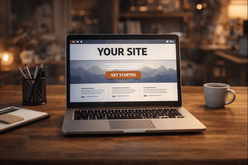
A simple homepage structure is usually enough to create a premium feel. Start with a clear headline, add a short explanation line, include one primary call-to-action, then support it with credibility. After that, show your main services or key features, answer common questions, and finish with a clean footer. When the page has a predictable flow, visitors relax because they don’t have to search for meaning.
The Website DesignMode24 mindset starts here because structure affects everything. A well-structured site looks better, reads better, and usually loads faster because you avoid unnecessary design elements.
Typography and Spacing Are the Fastest Upgrades

Typography can instantly upgrade your website without slowing it down. Premium websites use readable fonts, consistent sizes, and comfortable spacing. They don’t try to impress with too many type styles.
Keep your fonts simple. One font can work, two at most. Headings should look clearly different from body text. Body text should be easy to read and not cramped. If your paragraphs look tight and heavy, the site will feel stressful, especially on mobile.
Spacing is just as important. Premium design uses space to highlight what matters. When you add breathing room around sections and between lines of text, your site looks more intentional. It also becomes easier to scan, which improves the user experience without adding extra load time.
If you enjoy browsing multi-topic content that often covers online growth, lifestyle, and modern publishing ideas, you can also explore Flippamagazine.co.uk.
Color: Use Less, Look Better
Premium websites usually follow a controlled color system. Too many colors competing for attention makes a site feel chaotic. Choose one main brand color, one supporting accent color, and keep the rest neutral. The strongest benefit of a simple palette is consistency. Visitors start trusting your site faster because it feels stable and designed on purpose.
Mobile-First Design Makes a Site Feel Modern
A premium site should feel smooth on a phone, because that is where most users will see it first. Make sure your text is readable without zooming, keep sections shorter, and use buttons that are easy to tap. A clean mobile layout can make a simple website feel high-end.
Speed Is a Design Feature, Not a Tech Detail
Speed is part of the design experience. A slow site feels outdated. A fast site feels premium. Most slow websites become heavy because of large images, extra plugins, too many scripts, and unnecessary effects.
The Website DesignMode24 mindset treats speed as a core goal. If a feature doesn’t improve the visitor’s experience, it isn’t worth the load time it adds.
One Short Checklist You Can Use Today
To keep the site premium and fast, focus on a few basics:
- Use consistent fonts and comfortable spacing
- Compress images before uploading
- Avoid heavy sliders, popups, and extra scripts
Common Mistakes That Make Sites Look Cheap and Slow
Too many fonts, too many colors, too many sections, and too many widgets create a messy experience. Oversized images and background videos slow the site down and make it feel less professional. Weak readability also hurts—premium websites make reading easy.
The fix is usually simple: remove clutter, simplify the layout, compress images, and improve text spacing.
Conclusion
A website that looks premium and loads fast is built through smart, simple choices. Strong structure helps visitors understand you quickly. Clean typography and spacing make the page feel calm and professional. Mobile-first design keeps the experience modern. And speed-first decisions—compressed images, fewer scripts, and fewer unnecessary features—make the site feel smooth and reliable.
When you focus on clarity and speed, the way Website DesignMode24 suggests, you can build a website that feels high-end without being heavy.
