

Gone are the days when people used to get benefitted from desktop sites. People now prefer surfing mobile versions of websites because they can be accessed anywhere and everywhere. Having a mobile-friendly website becomes a necessity from an SEO POV. Here are some of the benefits of having a responsive website:
Google considers responsiveness as one of the ranking factors
In mid-2013, Google announced that responsiveness is one of the ranking factors. Many SEO experts have found it beneficial to work on mobile configuration. Google has made it a ranking factor because of users’ growing preference for this trend.
Did You Know?
These three are entirely different concepts – Responsive Design, Adaptive Design & Separate Mobile Site.

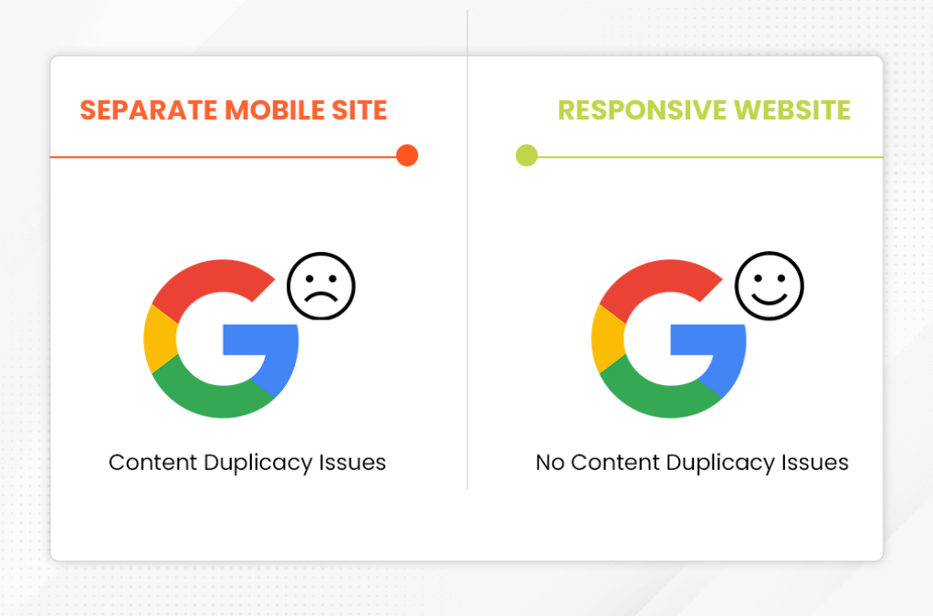
Dumps duplicacy issues
When you don’t make a website responsive, instead create a new website for mobiles, you’ll face content duplicacy issues. Google may drop your rankings either on mobile or desktop searches. But when you make your website responsive, content duplicacy issues will automatically be resolved.
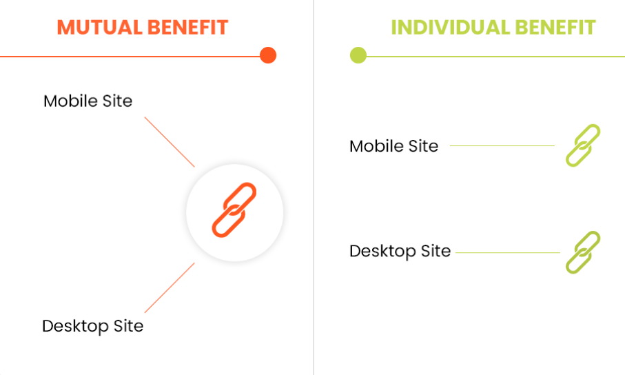
Link juice to both desktop and mobile sites
Having a responsive website delivers link juice to both desktop and mobile versions. But if you’ve created a separate website for mobile, you’ll have to work on two backlink profiles; one for mobile and another for desktop. Smart SEO Executives consider bringing responsiveness to existing websites.
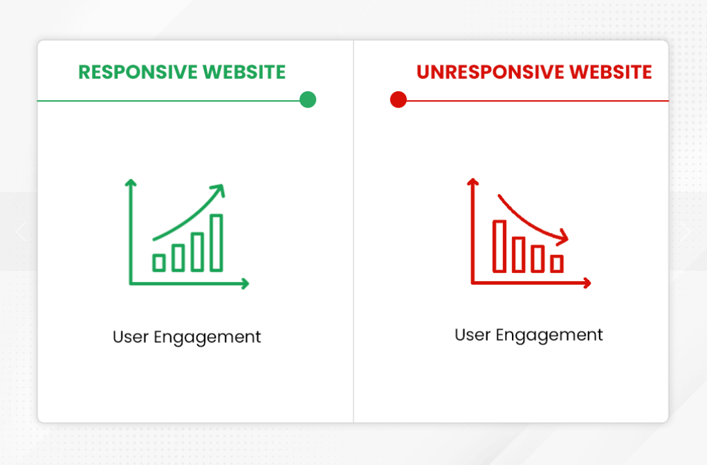
User Engagement
Users tend to engage more with the mobile versions than the desktop versions. If you want the users to spend time on your website, you’ve to optimize your presence on mobile devices. Also, having a mobile-optimized website increases your chances of converting hot leads to potential customers.
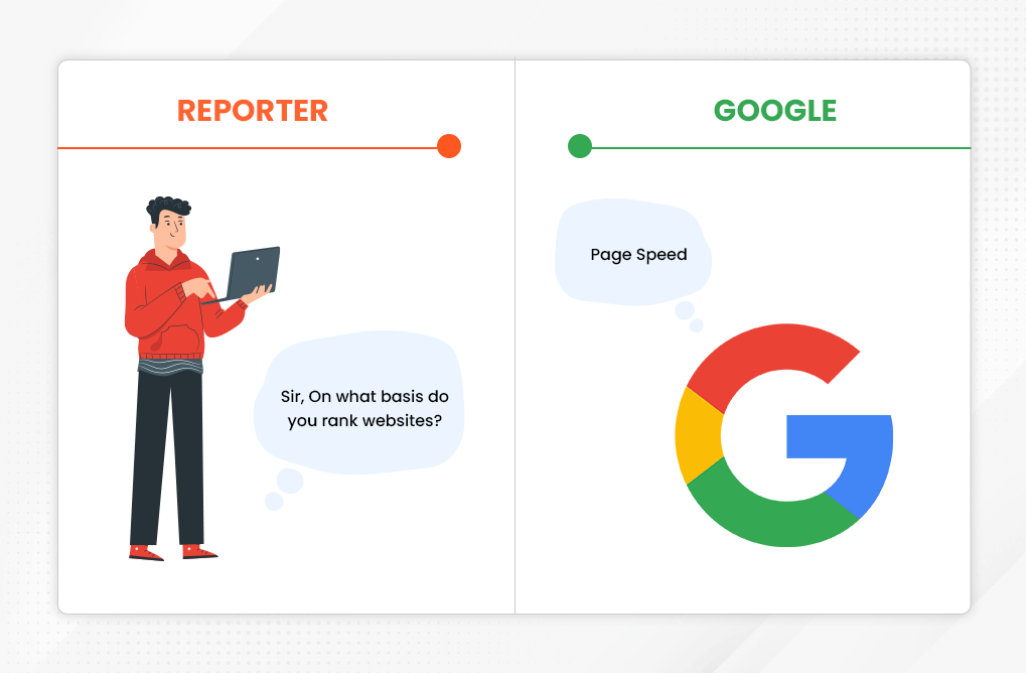
Improve Page Speed
Google heavily relies on page speed and has considered it as one of the ranking factors. A responsive website loads faster on all devices (mobile and desktop) and can resolve page speed issues. A page speed can make or break the user experience. No matter how beautiful your website is, nobody will stay there if it doesn’t load rapidly. Users are observed to have a likeliness for websites that are not aesthetically appealing but load instantly.
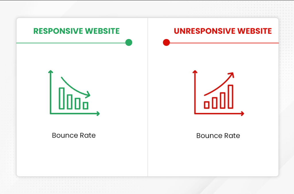
Lower Bounce Rate
The bounce rate is used to judge whether your site can convince visitors to spend more time on your website. A responsive website lowers the bounce rate by providing a positive experience to the users. Bringing responsiveness to the website is not a cup of tea. Only a highly reputed SEO company with an excellent customer satisfaction rate can help you achieve this goal efficiently.
Enhances Social Media Shares
When we have a mobile responsive website, we can increase the pace of social media shares as users have every social media app available on their mobiles, making it easy for us to share things on social media platforms: the more shares, the more benefits to your website.
Conclusion
Your website must be responsive if you wish to survive in the cut-throat competition of the digital world. Responsive design is giantly beneficial to reduce bounce rate and enhance user engagement. Besides, this concept is something Google is in love with. So if we show ‘no care attitude’ to what Google says, it’ll show ‘no care attitude’ towards your website’s rankings.