
In today’s business world, understanding and analyzing data has become more important than ever before. Companies rely on data to gain customer insights, identify trends, and make informed decisions. However, the sheer volume of data can often be overwhelming, and it’s crucial to have an effective way to present and analyze it. This article will explore how to design a dynamic dashboard to visualize and analyze data. Keep reading to learn more.
Understanding the Importance of Dashboards
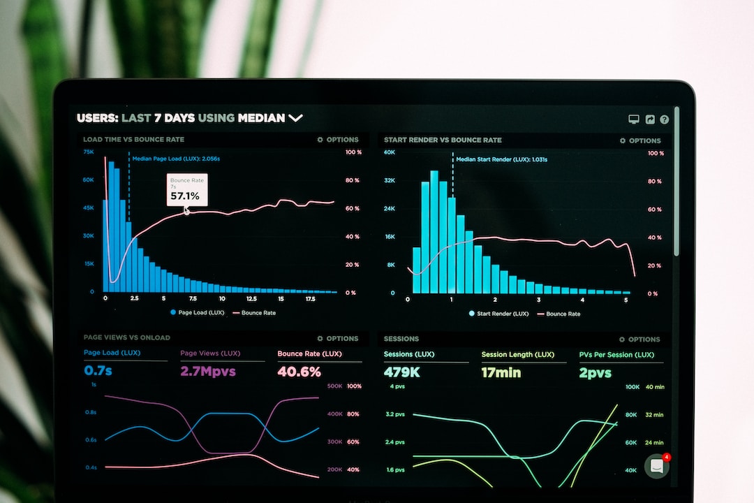
Dashboards are user interfaces that visually represent relevant data, provide an overview of business performance, and facilitate easy tracking of key performance indicators (KPIs). These panels simplify complex datasets by providing an interactive user experience and turning raw data into accessible insights that are easy to understand. Moreover, dynamic dashboards offer real-time analytics and interactive features. By understanding the metrics displayed on a dashboard, stakeholders can effectively make data-driven decisions, subsequently improving the business’s bottom line.
For instance, a marketing dashboard might showcase statistics concerning conversion rates, customer engagement levels, and return on investment (ROI) for various campaigns. Viewing these parameters simultaneously allows the team to swiftly identify patterns or trends and adjust their strategy.
In the current age of big data, the role of the dashboard cannot be underestimated. Businesses generate vast volumes of data every minute. It may become overwhelming without a controlled and organized way to visualize this data. Dashboard simplifies data tracking by digesting it, enabling businesses to leverage their data optimally.
Tailoring Your Dashboard to Your Audience
A critical factor that goes into designing dynamic dashboards is understanding your audience’s needs and level of data literacy. Different stakeholder groups within an organization might require varying depth and perspective of data. For instance, executives may prefer an overview focusing on key performance indicators (KPIs) and trends, while data analysts might require detailed information to draw substantiated conclusions.
Audience understanding ties back to the dashboard’s overall goal—effective data communication. To ensure this, the designer must consider the audience’s perspective on the dashboard’s complexity, visual hierarchy, and the type of data visualization tools used. When these considerations are balanced, the dashboard becomes a powerful tool that can disseminate important, easily understandable information across different organizational platforms.
Furthermore, it’s equally important to balance the amount of information displayed on a single screen. Too much data can confuse the viewer and dilute the message you wish to convey. On the other hand, too little information could lead to misinterpretation of data. Therefore, tailoring the data according to audience needs and preferences is crucial.
Incorporating Interactivity and Real-Time Analytics

Dynamic Dashboards offer great interactivity and real-time analytics, making them more attractive than static dashboards. This capability facilitates users’ interaction with the data, enabling them to scrutinize specific data points, filter out unwanted noise, and alter views to uncover deeper insights.
Incorporating real-time analytics in dashboard design means leveraging real-time data feeds. Real-time dashboards can provide more relevant and actionable data, allowing businesses to keep their fingers on the pulse of their operations. For instance, e-commerce firms can use real-time dashboards to monitor sales conversions instantly and react to changes within minutes.
Conversely, interactivity refers to letting the user manipulate the data presented according to their requirements. This could mean a range of features, from option selection buttons and sliding scales to full-powered drill-down functionality. Such features give end-users a deeper understanding of the data, enhancing their ability to make data-driven decisions.
The design of a dynamic dashboard requires a careful balance between visual appeal and functionality, a deep understanding of your audience, and effective data communication. A well-designed dashboard can make complicated data interpretation more manageable, steer toward better decisions, and drive business success.